Role: UI Design, Front-End Development
Deliverables: Style Guide, Wireframe, Website
Tools: HTML, CSS, Adobe XD, Adobe Photoshop
Project Type: Personal Project
Date: May 2021
INTRODUCTION
Objective
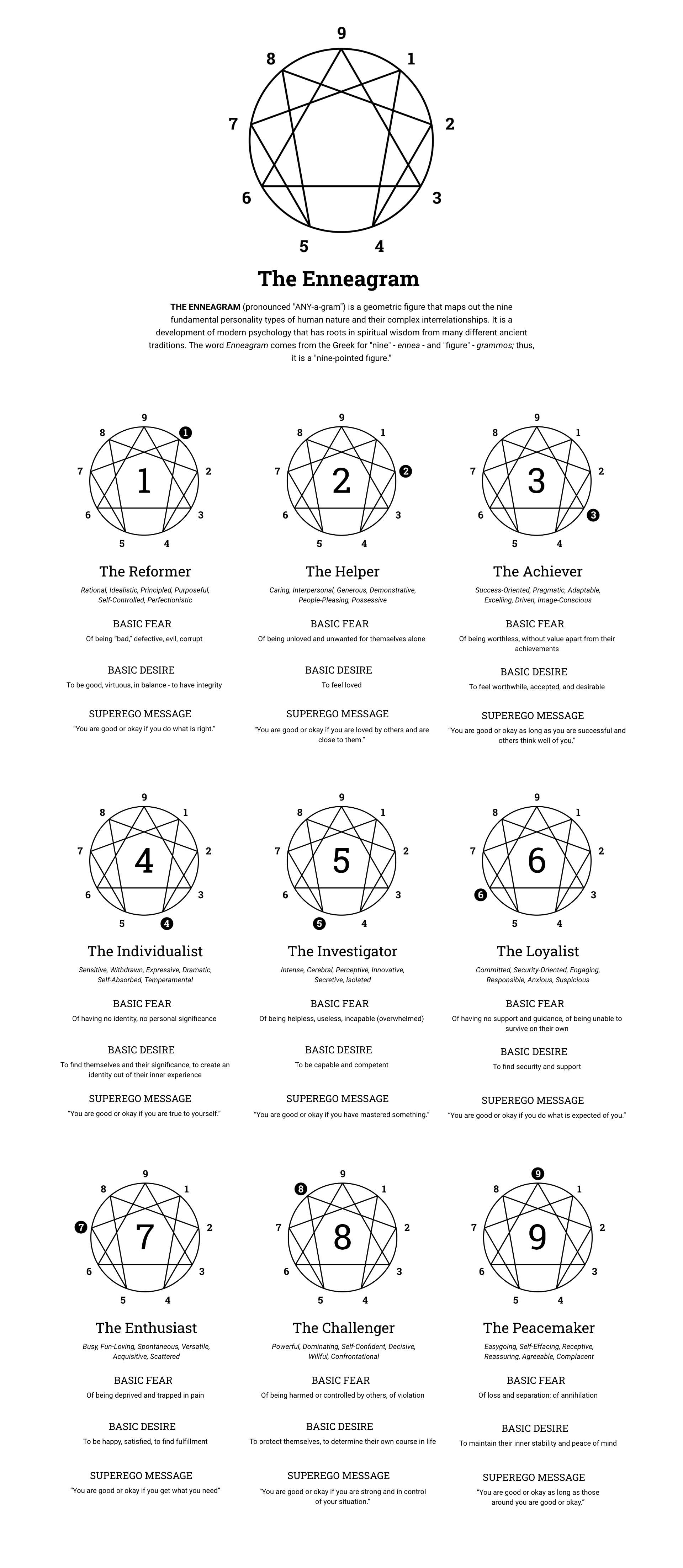
The objective with this project is to utilize CSS features such as Flexbox, CSS grid, and media queries to create a fully responsive, mobile-first webpage design. I decided to focus my subject matter on the teachings of the Enneagram, a personality type system, and find an elegant way to present its core concepts.
About the Enneagram
The Enneagram personality type system has nine types. “Enneagram” is the name for the nine pointed symbol used for the system, and literally means "nine-pointed figure.”
Each type has different characteristics, a different set of desires and fears, and resists reality in different ways.
The names for the nine types are as follows:
The Reformer
The Helper
The Achiever
The Individualist
The Investigator
The Loyalist
The Enthusiast
The Challenger
The Peacemaker
There are also three instinctual variants that we have that interact with our main type. These are called Self-Preservation (the search for survival), Social (the search for community), and Sexual (the search for intimacy). According to the system, everyone has a dominant type and a dominant instinct. Read the final webpage I created for more information on the types and instincts.
STYLE GUIDE
Color Palette
For the color palette, I wanted to utilize a few different shades of purple to separate out elements on the page. I chose purple because it is associated with the mystical or spiritual, and the Enneagram is a mystical system.
Typography
I decided upon using Roboto Slab, a slab serif font, for all headings, and Roboto, a sans serif font, for body text. This gives a modern, elegant look with a little personality thanks to the slab font.
WIREFRAMES
With my wireframes, I explored a few different layout options. I played with single column vs multicolumn layouts, centered text vs left aligned text, and different placements for the Enneagram images.
MOCKUP
In my final mockup, I added more content and visual details. I added the Instinctual Variants section (which was missing in the wireframes), as well as a link to an Enneagram personality test. I separated the nine Enneagram types according to their triads, which are groupings of three types: the gut triad, the heart triad, and the head triad. I added additional details about each triad, including an image and description. I also added the colors and typography as seen in my style guide.
WEB DEVELOPMENT
I coded the site from scratch using HTML and CSS. I used HTML tags introduced in HTML5 such as header and nav for the site header and main navigation, section for each separate section of the page, and article for each Enneagram type card.
On a regular full screen web layout, the three types per triad are displayed in three columns using CSS grid. On a smaller, tablet-sized screen, there are only two columns, with the third type breaking onto a second row. On mobile screens, there is only one column for all the content on the web page.
I went with a mobile-first approach with my web development, which means the base styles for the site apply to the mobile screen layout, and any adjustments to the design at larger screen widths are made in media queries using the min-width property. Writing the CSS in this way reduces the amount of code that is needed, since I only needed to make a few additions for the larger screen sizes.
CONCLUSION
This project was a great exercise in UI design and front-end web development. It involved designing a style guide, exploring solutions across several wireframe designs, and utilizing modern web development techniques to create a fully functioning, mobile-first website. The use of CSS features such as Flexbox, CSS Grid, and media queries allowed this project to be easily and effectively developed as a fully responsive website that adapts well to any screen size.


