Domino’s
A case study and redesign of Domino’s website features.

Role: UX Research, UX Design, UI Design
Deliverables: Case Study, Wireframe, Mockup, Prototype
Tools: Adobe XD
Project Type: Personal Project
Date: December 2020
INTRODUCTION
In 2020, I performed a case study of the Domino’s Pizza website, investigating ways to improve the online ordering experience. Following the case study, I performed a redesign of a few features of the site to create solutions to the problems found in the case study. This was done as a personal project, unaffiliated with the Domino’s company. Below is an outline of my process.
CASE STUDY
I had six participants complete a list of tasks for three pizza company’s websites: Domino’s, Papa John’s, Pizza Hut. These users were between the ages of 25 and 55 and were all regular pizza eaters, familiar with the online pizza ordering process. The tasks given to these users on each site were to:
Order a pepperoni pizza
Order a custom made pizza
Order with a coupon / special / deal
Order a large amount of pizzas (5+)
Each participant completed these tasks for each pizza company on a desktop computer. I had each participant talk aloud about their thinking process as they completed the tasks on each website. After exploring and reviewing the process with each of them, I identified three main problems with the Domino’s site.
The problems were:
Problem A: No standard one-topping pizza options
Problem B: Price, calorie count, and quantity info missing
Problem C: Limit of toppings for coupon isn’t indicated
Problem A: No standard one-topping pizza options

Problem: The site only offers a Build Your Own Pizza option, along with Specialty Pizzas, but no popular one-topping pizzas.
Why this is a problem: As my users were looking for a pepperoni pizza option, they couldn’t find one. The only option available is to use the Build Your Own Pizza wizard. The issue is, the wizard involves more clicks, as there are several screens that are a part of the wizard. My users had an easier time on Papa John’s and Pizza Hut’s websites when searching for a pepperoni pizza because they offer a pepperoni pizza option alongside with sausage, cheese, and Build Your Own.

Solution: Next to the build your own pizza option, add standard options for cheese, pepperoni, and sausage. Introducing standard one-topping pizza options will reduce the amount of clicks by 67%.
Problem B: Price, calorie count, and quantity info missing

Problem: When browsing the menu, the items on the site have no price, calorie count, or quantity count, only the image and name.
Why this is a problem: Four of my six users had an issue with this because they want to know how much food they’re buying (by calorie or size), how much it will cost, and want an option for increasing the quantity. The site only shows this information in the cart. Competitor websites Papa John’s and Pizza Hut did not have such an issue.

Solution: Include price, calorie count, and quantity information upfront. This way, the users won’t have to add items in the cart to later discover a price or quantity that doesn’t work for them.
Problem C: Limit of toppings for coupon isn’t indicated

Problem: When choosing a coupon, the user is forced to go through the Build Your Own Pizza wizard to select their pizza option (usually for a one topping pizza). However, this is a problem because, if the user adds more than one topping, the coupon is no longer applied. There is also no indication that too many toppings have been added and that the coupon is now broken. Four of my six users became frustrated with this process because, by the time they finished the wizard, they had to empty their cart and start the whole process again.

Solution: Fade out toppings options once max toppings have been reached. Also, include text notification that clarifies how many toppings are permitted. This way, toppings will never exceed the coupon limit and the checkout process won’t need to be repeated.
DESIGN PROCESS
Following the case study, I performed a redesign of elements of the Domino’s website that needed fixing. I created a wireframe, mockup, and prototype of my solution. What I discovered in the case study was that the Domino’s website need to improve their coupon wizard design, as well as their notification system when building custom pizzas based on coupon requirements.
Coupon Wizard
The coupon wizard on the Domino’s site is difficult to understand, as the details for the coupon are listed in one long run-on sentence. They aren’t broken up sequentially by item. My solution was to redesign the coupon wizard so that each item in the coupon is listed underneath each other as a numbered step in the process.
BEFORE

Domino’s current coupon wizard. Description is one long run-on sentence and is not broken down sequentially.
AFTER

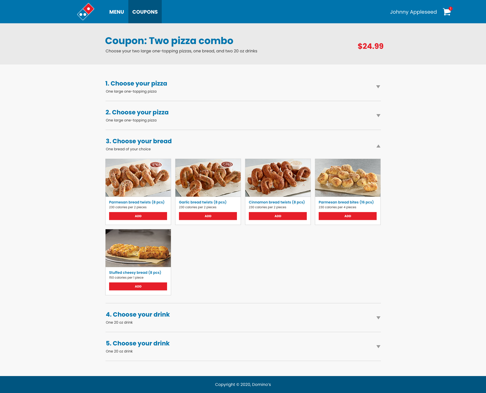
Coupon wizard redesign. This design breaks each item in coupon down by steps, with each step underneath the last, with different options for each item shown on screen.
Create Your Own Pizza Wizard
This wizard was redesigned with a new layout, showing the pizza on the left and the options on the right. The main issue with the original design is that it didn’t include notifications for limits on toppings that are required to complete the coupon properly. In my redesign, I faded out other options once one topping was selected, as the coupon in this case is limited to one topping.
BEFORE

Domino’s current pizza wizard (as of 2020). This wizard fails to notify the user that there is only one topping permitted for the coupon.
AFTER

Pizza wizard redesign. Fades out options once the one topping limit has been met, and includes notification text, “Only one topping available for this coupon.”
WIREFRAMES

Coupons page

Coupon Wizard - Choose Your Pizza

Coupon Wizard - Choose Your Bread

Coupon Wizard - Choose Your Drink

Pizza Wizard - Size & Crust

Pizza Wizard - Cheese & Sauce

Pizza Wizard - Toppings

Pizza Wizard - Sides
MOCKUPS

Coupons page
Coupon Wizard - Choose Your Pizza
Coupon Wizard - Choose Your Bread

Coupon Wizard - Choose Your Drink

Pizza Wizard - Size & Crust

Pizza Wizard - Cheese & Sauce

Pizza Wizard - Toppings

Pizza Wizard - Sides
PROTOTYPE
This prototype is an interactive solution to the main issues found in my case study. The prototype starts on the coupons homepage, and continues to the coupon wizard. When selecting a pizza it shows the create your own pizza wizard, then returns to the coupon wizard to finish all selections for the coupon.
CONCLUSION
Building a case study by comparing Domino’s to other competing pizza companies was an eye opening process. It was interesting to perform an in-depth comparison of features between company products, as there were many things that were similar, but there were some ways in which Domino’s came up short. Domino’s did not include any standard one topping pizza options on their site, like their competitors. They also forgot to include essential product information, such as price, calorie, and quantity. Perhaps their biggest issue was with how their coupons interacted with their Create Your Own Pizza wizard, where the user was improperly guided towards making a pizza without being notified of the limited options available in the coupon. Fortunately, I was able to discover and implement solutions that allowed their coupons to interact with the pizza wizard in a more intuitive and effective way.